GenCrafts Watercolor Lightfast Test
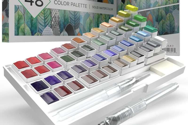
Monday, November 13, 2023Nearly eight months ago, I started a lightfastness test for a set of watercolor markers, a set of jelly gouache, and three watercolor palettes, including a metallic 24 set and a classic 48 set from GenCrafts. I made wide swatch cards with each color, then cut them in half lengthwise so that I had each color on two strips from the same swatch. The control side went into a drawer for later comparison.
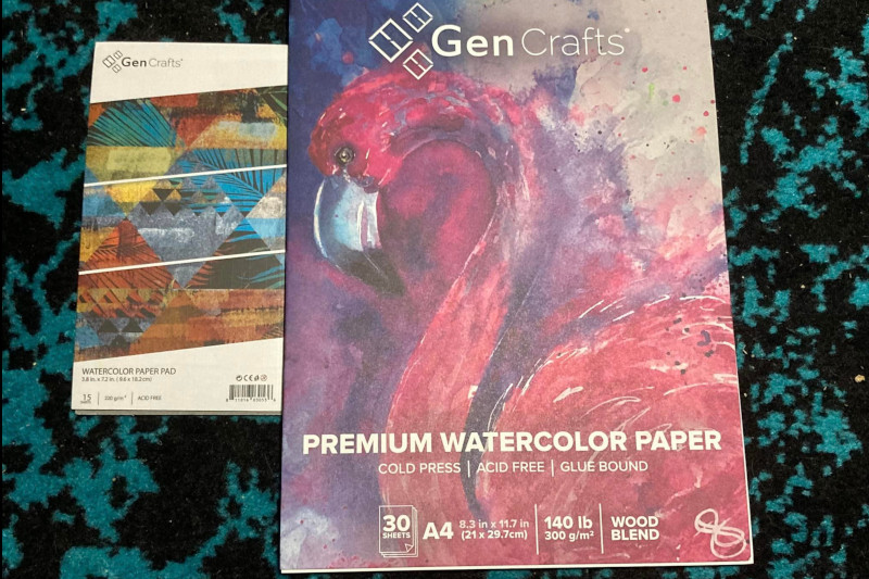
Paper Used:
With this particular lightfastness test, I made the mistake of using two different papers from the same company and assuming they were the same, or close enough. The small pad came free with my 24 set of metallic GenCrafts paints while I bought the larger pad separately. The paper from the smaller pad ended up turning brown in the sunlight, which made it harder to accurately detect fading and color shifts in the first 41 colors on the classic palette. The metallic palette was tested completely on the larger paper that did not brown, so those results are a bit easier to decipher. In the future, I will make sure to use a tried-and-true paper for my lightfastness tests.
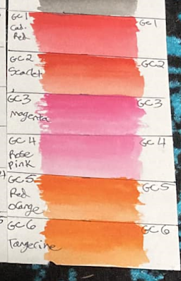
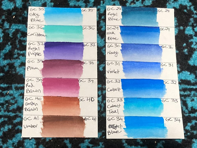
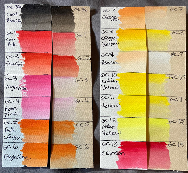
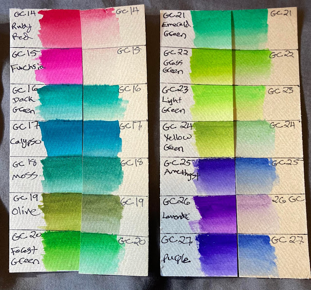
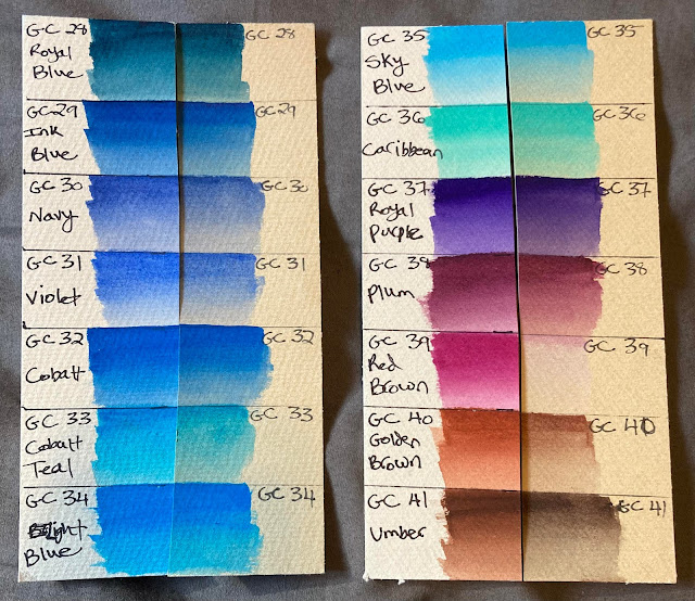
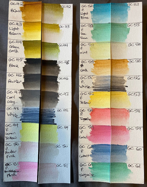
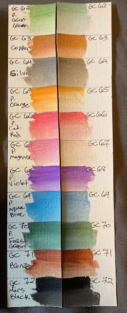
GenCrafts Watercolor Swatches Before:
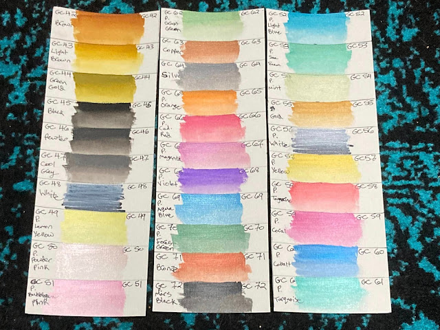 |
| Colors 1-48 are the colors from the "classic" set. Colors 49-72 are from the "metallic" set. White paints were applied over a Sharpie scribble to show opacity (or lack thereof). |
Conditions:
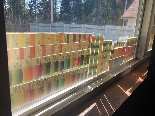
The strips went up in a double-paned vinyl south-facing window from March 21st to October 25th of this year (about 7 months). Near the equinoxes, these strips got full sun exposure, but at the height of summer, the eaves on the roof left them with only indirect light. This is enough to show fading in the most unstable pigments, though a longer test might have been better to test some of the paints.
I eventually took all of my test strips down because I noticed some condensation on the window in the mornings after I rearranged my room to put the bed closer to the window. That may have messed with some of the results from other paints, but the strips for the GenCrafts palettes did not seem to be affected.
Hypothesis:
These are student-grade paints, so I expected that some of the colors would fade and some would not. I expected that colors would fade more when applied in a light wash like watercolor than thickly in mass tone. I had not seen any other lightfast tests online for these paints when I went looking, so I didn't have any specific colors to watch out for based on that. Bright purples and pinks are often fugitive (because of dye-based pigments) while earth tones tend to be inexpensively made with more stable pigments, so it would not surprise me if the purples and pinks faded the most and earth tones were most stable.
Results:
In the classic 48-set, I found the worst fading in magenta, rose pink, orange, peach, ruby red, fuschia, yellow green, lavender, and "red brown" (which is a burgundy color that doesn't look brown at all). There also seemed to be some fading in cadmium red, red orange, tangerine, orange yellow, indian yellow, yellow, olive, forest green, amethyst, purple, cobalt teal, golden brown, umber, brown, light brown, and green gold. I noticed shifts in neon yellow, crimson, olive, grass green, royal blue, cobalt teal, and royal purple, though it is difficult to tell if all of those were the paints or if some of them were caused by the browning of the paper. All other colors seemed unaffected, though I'm not going to list them out because there are 18 and I've written enough redundant lists today. The most interesting thing to note for this palette is that a surprising number of the earth tones faded, which is not what I expected to happen.
In the metallic set, I found the worst fading in the bubblegum pink, mint, and magenta. Powder pink, coral, grass green, orange, cadmium red, and violet also had significant fading or shifts. I noticed a slight fade with the yellow and "tangerine" (which looks more like the inside of a ruby grapefruit than any part of a tangerine).
I was excited to note that a few of my favorite paints from both sets did not fade or shift. These included calypso, moss, and Caribbean in the classic set, and sea foam and turquoise in the metallic set. Much rejoicing. Those were some of the unique colors that compelled me to buy the GenCrafts paints in the first place, so I'm happy.
Takeaways:
I'm not sure yet how this test will affect my process because I don't remember which paints from the classic 48 set I kept, and which I passed on to a budding young artist when I restructured my student-grade paint collection to have all of my favorite paints in one set. In general, I like to avoid the most fugitive pigments and use some form of UV protection for gifts, but I also have a Paul Reuben's 48-color palette that is a bit more lightfast than either the GenCrafts classic or the Mei Liang 36-set that I also did a lightfast test on. Since I gave away 26 of the colors from the GenCrafts classic palette, I won't be able to repeat the lightfast test on that entire set, but I may repeat it on the colors I still have, especially any that were tested on the paper that turned brown during the test.
When I tore apart my GenCrafts classic 48 and Mei Liang 36 palettes to make a 48-color palette of my favorite paints, I referenced Kimberly Crick's lightfast test on the Mei Liang set so that I could remove the most fugitive colors from that palette, but I had no idea which colors in the GenCrafts set would be good and which would fade. The final palette had 26 Mei Liang colors and 22 GenCrafts colors. I'm hoping that I used predominantly Mei Liang colors for the earth tones since they were all pretty lightfast and I prefer the formulation/texture/transparency of that paint anyway, but I won't know until I dig out the palette and look. That may be a post for another day.



0 comments